
Saul Bass
LOGOS and TRADEMARKS
Many people who never heard of Saul Bass are surprised to learn really how much of his work they know,
which has appeared on everything from brochures to billboards.
Below some examples - there are more. I'm adding them as I run across them. A logo is a nice source of income for designers; they get paid every single time it's used, from cocktail napkins to business cards.
These are arranged alphabetically

From cover for brochure
Strathmore Paper Company, 1991
Ajinomoto
unknown

below: present trademark

Alcoa
1963

special typeface
"Alcoa Alphabet"
AT&T
1984
replaced 2000 by Young & Rubicam and InterBrand version
replaced 2005 by the new "3D" logo
Avery
unknown

Bell
1969

Celanese
1965
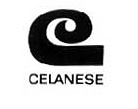
(below: their present logo)

Continental
date unknown


(below: their present logo)
Dixie
unknown

Exxon
1981

based on 1966 design

by Raymond Loewy
Girl Scouts
1978

Japan Energy Corporation
1993

Kibun Foods
1984

Kleenex
unknown

mistakenly attributed to Saul Bass
Kose Cosmetics
1991

Lawry's Foods
1959

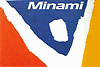
Minami Sports
1991
Minolta
1978

Quaker Oats
date unknown

click on it to see the one it was based on
(it's still in use)
Rockwell International
1968

(below: new one, not by Saul Bass)

United Way of America
1972

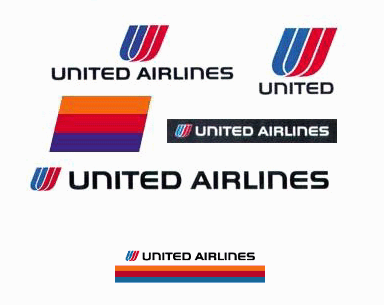
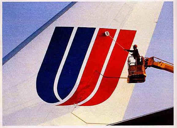
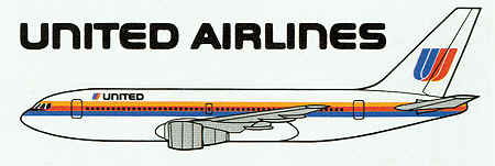
United Airlines
1973
For United Airlines Saul Bass also made the short From Here to There

shocking!
"A man who can lower himself to wearing a moustache
might just as well grow a beard"
P.G. Wodehouse, Jeeves and the Feudal Spirit
Warner Books
ca. 1970

Y.W.C.A.
date unknown

Every company, from small privately-owned businesses to large title loan companies like TitleMax,
should know that a company's identity is visually expressed through its logo.
Social Media | Company Videos | TitleMax
magazines
In the early 1960s the Saturday Evening Post decided they needed a face lift. Among those of other great designers like Avant Garde's Herb Lubalin, suddenly Saul Bass' layouts appeared in the magazine. Which I happened to read at the time as it came to the N.C.O.-mess of the army unit where, much against my wishes, I was doing time then. Fool that I am—I never ripped them out and off. Another item I used to have but am still, in desperation, looking for is the design he did for Esquire, where his logos grow out of Otto Preminger's forehead.
I'm sure there has been more.
books
there may be many more, like Saint Joan
Psychology, 1987
2nd edition, 1989
record sleeves
sound-track recordings are under movie titles
Frank Sinatra conducts Tone Poems of Color
2nd edition, 1989
more on

| Movies |
the most complete list of his movie work around dates, directors, alphabetical listing, posters, ads, record sleeves, book designs - the works |
| Genius vs. the Mediocre | the collaboration of Saul Bass and Alfred Hitchcock Psycho - Vertigo - North by Northwest |
| Posters |
not only for motion pictures unused designs, Oscar ceremonies, film festivals, other |
| More Movie Graphics | honor where honor is due: more good artists in this field |
| Screen Aspect Ratios | how you hardly ever see a movie as it was meant to be seen |
| Bass Books | Books on, about and by Bass |
| Bass Business Bust | how the Dutch never got to see The Searching Eye |

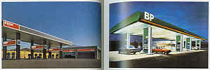
You can't win 'em all: compare these by Saul Bass
with the Most Beautiful Gas Station in the World - in Italy
photographs from 6 Chapters in Design
back to


SEARCH this site or the Web

copyright notice
all material on this site, except where noted
copyright © by , curaçao
reproduction in any form for any purpose is prohibited
without prior consent in writing
logos ® belong to their owners
